Accessibility Implied
Heather Migliorisi
Disclaimer: Everything presented here is my own and does not reflect the views of my employer.
What is (Web) Accessibility?
Web Accessibility - A digital world for everyone, regardless of ability.
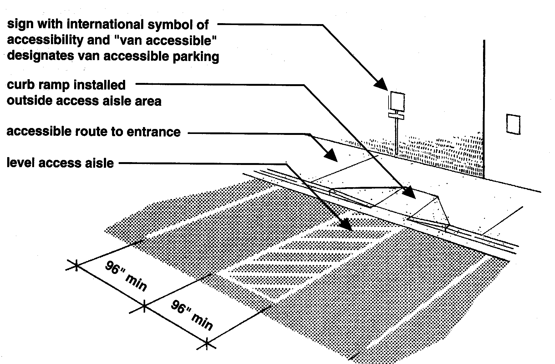
Classifications
Vision (approx 8.1 million people)
Hearing (approx 7.6 million people)
Motor (approx 19.9 million people)

Video
Listing from apple.com
Cognitive (approx 9.4 million people)
Things to consider...
What about you?
Environmental Conditions
Temporarily Disabled
Getting Older
What are the benefits?
Reasons for making things accessible:
- Money
- Legal
- Benefits Everyone
- Future Technology
- Ethical
Money
- Larger potential consumer/user base
- Census Data Concludes: Nearly 1 in 5 People Have a Disability in the U.S.
- Work With the Government
- Businesses must comply with Section 508 when supplying Electronic and Information Technology
Legal
- Title III of the ADA requires that public and private establishments provide reasonable accommodations to the disabled
- The DOJ has stated that law applies to online entities as well
- Dealing with legal cases can harm brand/identity and be very costly
Benefits Everyone
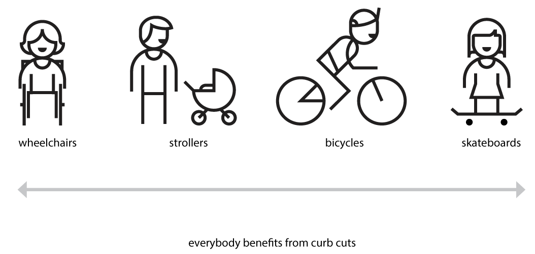 Image from Microsoft's Inclusive Design Toolkit
Benefits Everyone
- Transcripts: People that want to listen to podcasts and read the transcripts for better learning and comprehension
- Good contrast levels makes content easier for everyone to read
Future Technology
Future Technology

Ethical
- It's the right thing to do.
We Are Addicted
There's No Hope
#OneDayWithoutInternet
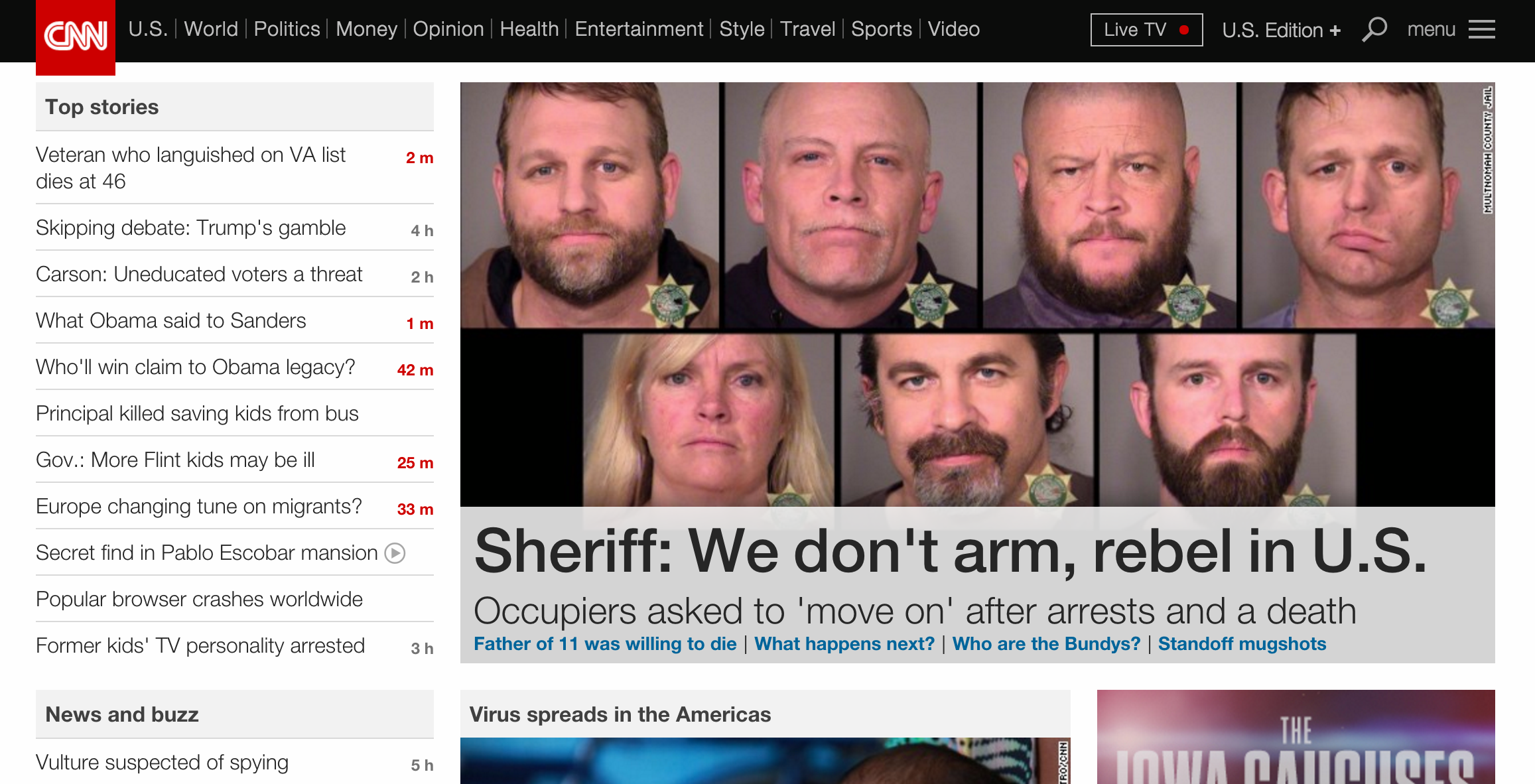
What if...
You go to buy the latest/greatest tech gadget, but a blank page is all that loads.
...the page is freaking out and filled unrecognizable errors
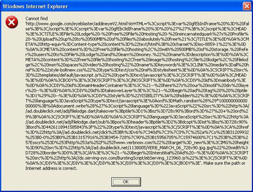
What if...
every website you visited and app you used was like this?
When do you give up?
Giving up is not an option for people with disabilities.
Let's do our part to fix this problem.
Let's talk about construction...

Accessibility is NOT a feature,
it's part of the foundation.
You say you'll add accessibility later...
Who Should be Responsible for Accessibility?
Accessibility is not a specialist position.
One person* cannot make and maintain an accessible product alone.
*Unless this is a tiny, one person product/project.Accessibility needs to be a product goal.
So it's incorporated into the process:
- Content Strategy
- UX/Design
- Development
- QA Test
Think "POUR"
The four main guiding principles of accessibility are:
Perceivable - provide content alternatives (images, audio, video)
Operable (without a mouse)
Understandable - clear and simple (writing and functionality)
Robust - works across many devices
1. Content Strategy
Image from http://www.infrontoftheline.com/blog/content.html
Content Strategy Considerations:
- Readability: Comprehension
- Alternative Text for Graphics
- Closed Captioning
- Transcripts
1. Readability: Comprehension Image from: http://uxmastery.com/readability-tests-magic-formula-or-recipe-for-disaster/
Testing
2. Meaningful Alternative Text
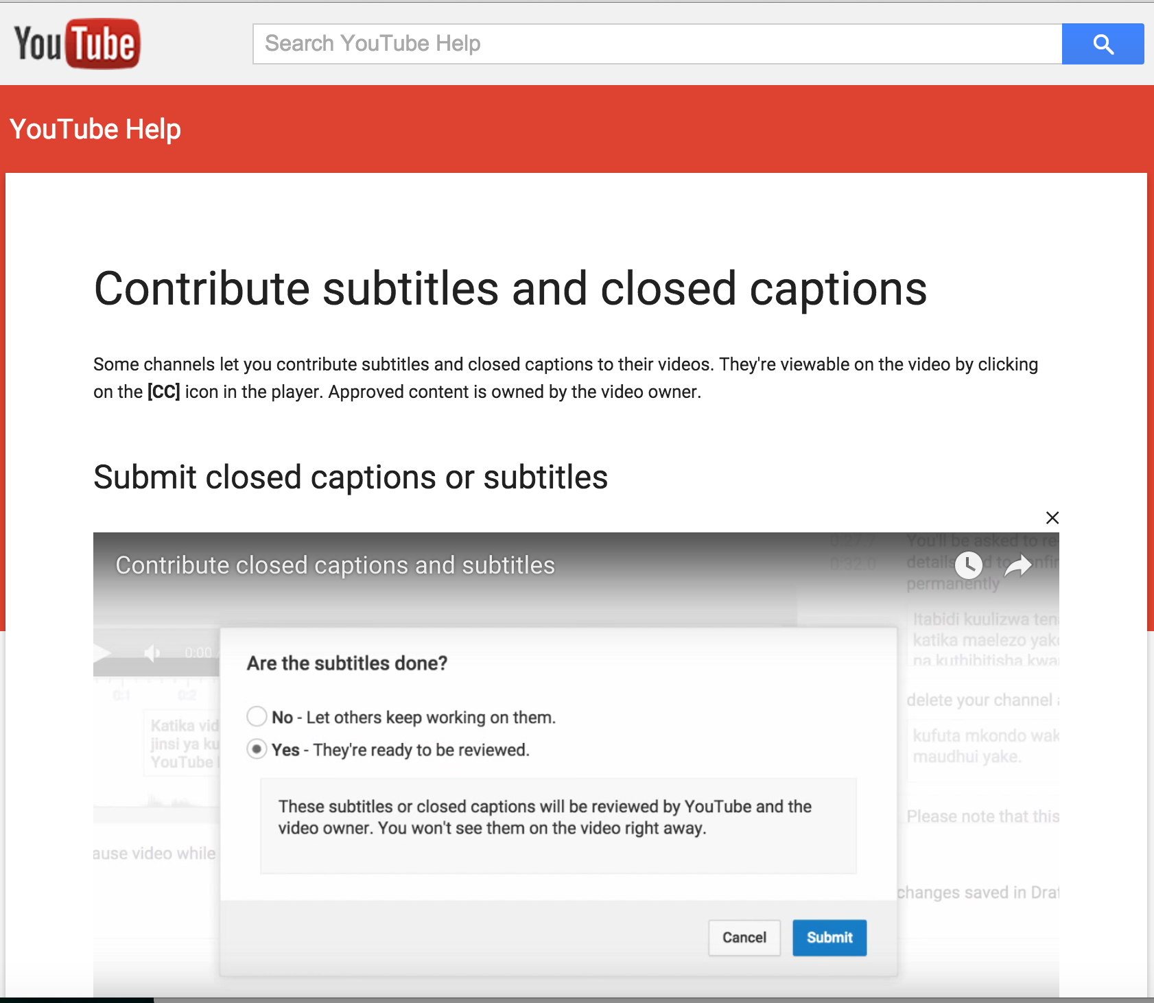
3. Closed Captions
Simple. Do it.
![]()
But, DON'T do it with YouTube.

Because it's awful!

Unless ... they are edited
4. Transcripts
Do it with style.
2. UX/Design
Not Plain
Not Boring
Design Considerations:
- Personas
- Contrast
- Color
- Readability: Fonts and Text
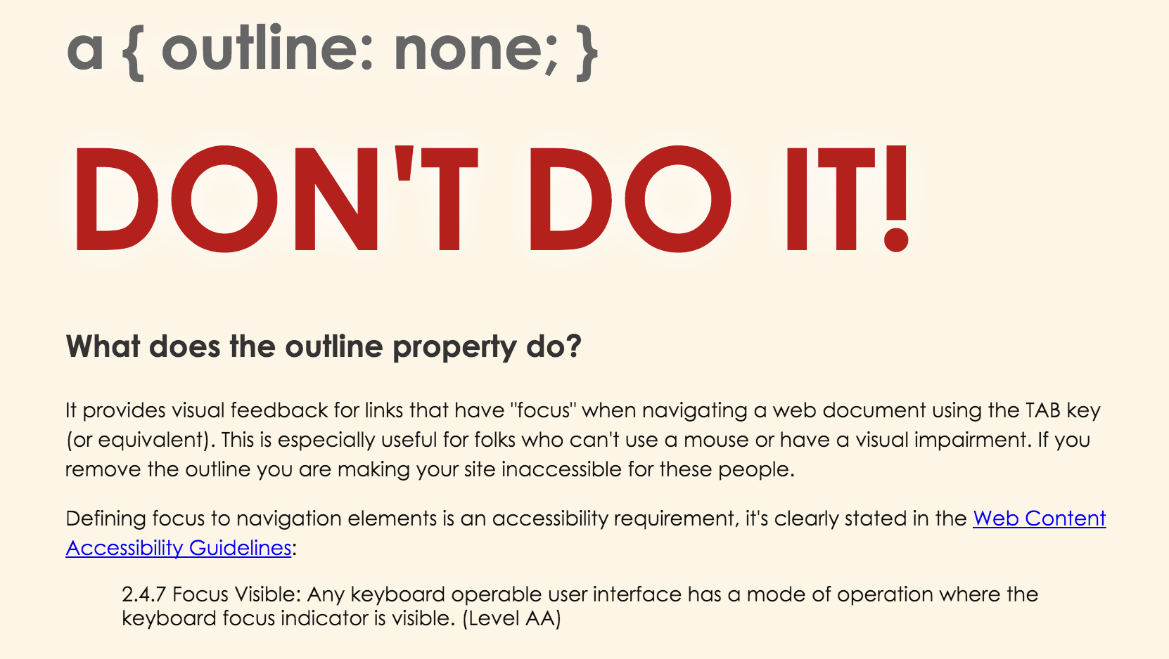
- The Focus Outline
- Animation
1. Personas
Persona from Book Excerpt: A Web for Everyone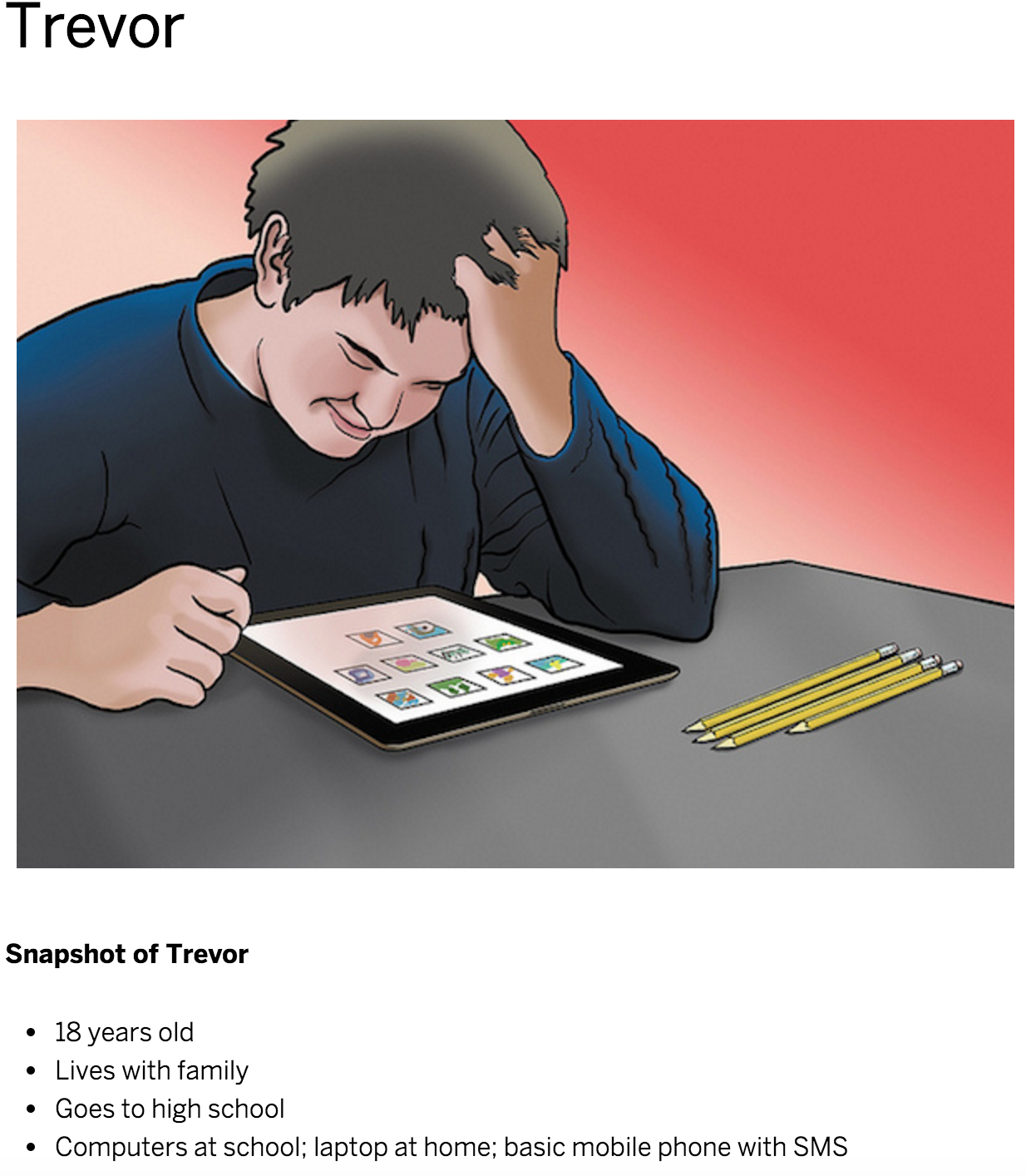
Update personas to include 3 A's:
 Persona from Book Excerpt: A Web for Everyone
2. Contrast
The difference in color and light between parts of an image. -wikipedia
How can we check this?
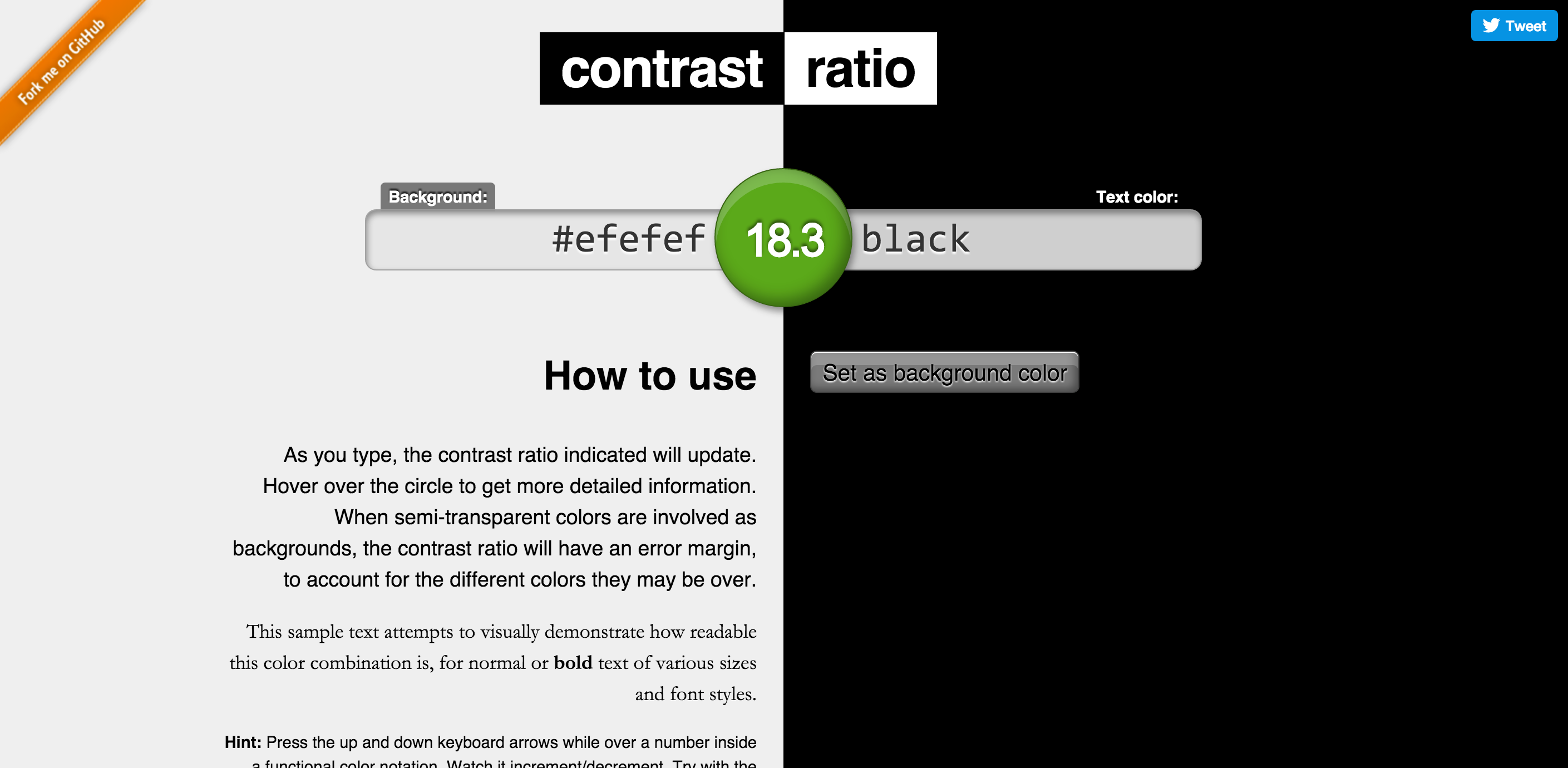 By Lea Verou
How can we check this in sketch?
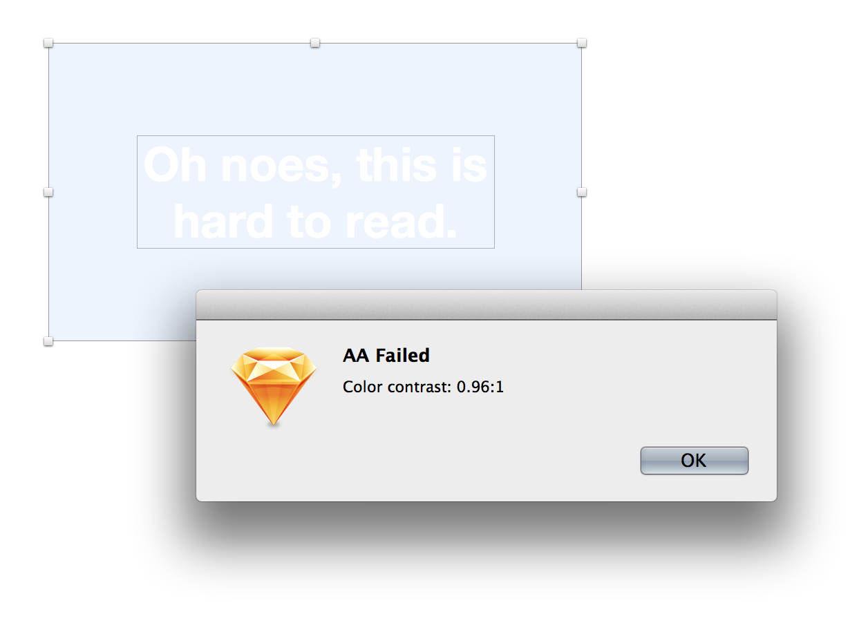 By getflourish
How can we check this on a live site?

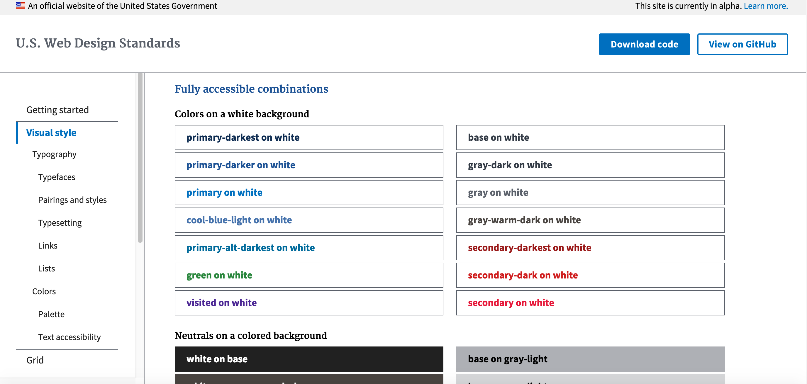
3. Color
Meaningful Without Color
Bad: Error Messaging Relies on Color
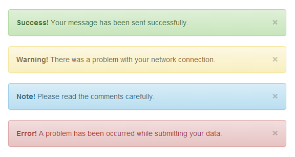
Meaningful Without Color
Better: Message Conveyed With Icons
![]()
Testing

Good Example: Provide Options
4. Readability: Fonts and Text Image from: http://uxmastery.com/readability-tests-magic-formula-or-recipe-for-disaster/
Readability: Easy To Read and Understand Content
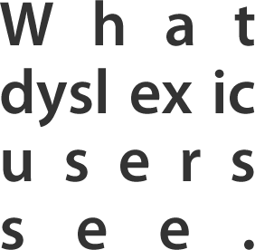
- Make sure the text is large enough and has proper contrast.
- Choose easy to read fonts.
- Left align the text. It's easier to read.
- Avoid all caps
- Avoid large chunks of italicized text
5. The :focus Outline
6. Animation
Things to avoid:
- Large areas of motion and the parallax-like effects of background and foreground moving at different speeds
- Autoplaying carousels without controls to pause or stop it
- Scrolljacking - background animates at a different speed than your scrolling effort
3. Development
Development Considerations:
- Aria
- Valid HTML
- Semantic HTML
- Focus Management (aka - Keyboard Accessibility)
- Canvas
- SVG
- Forms
1. ARIA
ARIA: provides a set of attributes that you can add to HTML elements.
- role
- state
- property
First rule of ARIA use
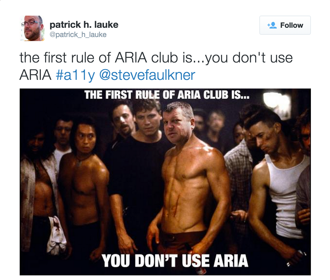
First rule of ARIA use: Don't use it!
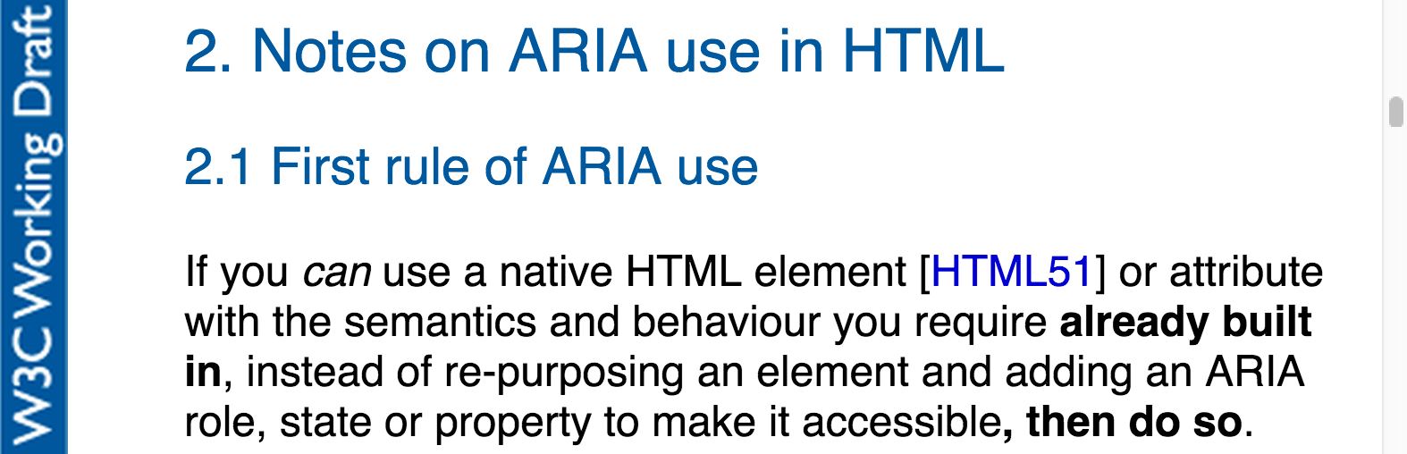
"ARIA roles add nothing to default semantics of most elements" - Steve Faulkner (source)
Don't add default implicit roles to elements
❮button role="button"❯ button text ❮/button❯
Don't add ARIA state or property attributes in addition to their native HTML counterparts
❮input type="text" required aria-required="true"❯
❮div hidden aria-hidden="true"❯
Don't add ARIA roles and states or properties to long-implemented structural elements
❮h1 role="heading" aria-level="1"❯heading text❮/h1❯
New(ish) HTML5 Elements with default implicit semantics
What this means is that, where implemented, the browser will expose the default implicit semantics of the element so you don’t have to.
❮header❯ maps to role="banner"
❮nav❯ maps to role="navigation"
❮main❯ maps to role="main"
❮section❯ maps to role="region"
❮article❯ maps to role="article"
❮aside❯ maps to role="complementary"
❮footer❯ maps to role="contentinfo"
New(ish) HTML5 Elements: Browser Support
New(ish) HTML5 Elements: Browser Support
BUT IE and Safari do not offer support for all of the role mappings. -Deque University
USE it for Landmark Roles
❮header role="banner"❯
❮nav role="navigation" ❯
❮main role="main" ❯
❮footer role="contentinfo" ❯
2. W3C Validation
Note - conformance checking
W3C Validation
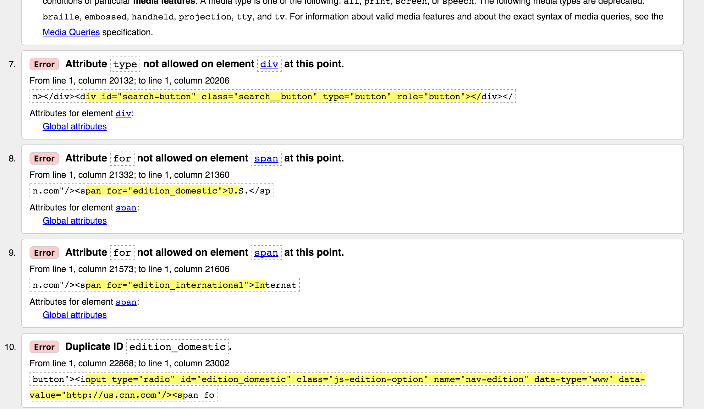
Notes on conformance checking
3. Semantic HTML
- Headings
- are meant to help users understand content hierarchy
- levels should not be skipped (BAD - h1, h2, h4)
- Links, Buttons, Divs and Spans
- Links - are being styled like buttons, which is fine. Just don't mark them up as buttons.
- a, div and span ARE NOT buttons
Products - if it acts like a button, make it a
4. Focus Management
(aka - Keyboard Accessibility)
Tabbing. Does it: Highlight what it's on?

Does it: Jump somewhere unexpected?
Do you have to go through the main nav?
Provide a skip nav

Provide skip to page sections
5. Accessible SVGs
6. Accessible Canvas
Off Screen Text
//hiding text elements from the view, but keeping them available to the screen reader
.sr-only {
position: absolute !important;
height: 1px;
width: 1px;
overflow: hidden;
clip: rect(1px, 1px, 1px, 1px);
clip-path: polygon(0px 0px, 0px 0px, 0px 0px, 0px 0px); //for clip being deprecated
}
7. Functional and Logical Forms
Forms
- DO NOT use positive
tabindex="1" - Label everything and link the label to the input
Document
Add Automated Testing:
- NPM: https://www.npmjs.com/browse/keyword/a11y
- Gulp-a11y
- Grunt-a11y
- Tenon
- Ember
- React
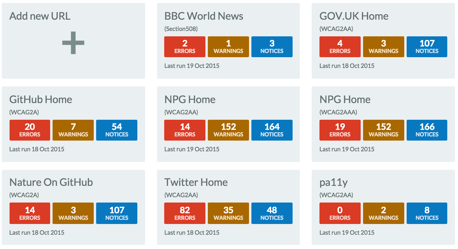
- pa11y (dashboard): http://pa11y.org/
pa11y http://pa11y.org/
4. QA Testing
QA Testing
- Tools
- Assistive Technology
- People
Online Testing Tools
- http://wave.webaim.org/
- http://tenon.io/
- http://leaverou.github.io/contrast-ratio/
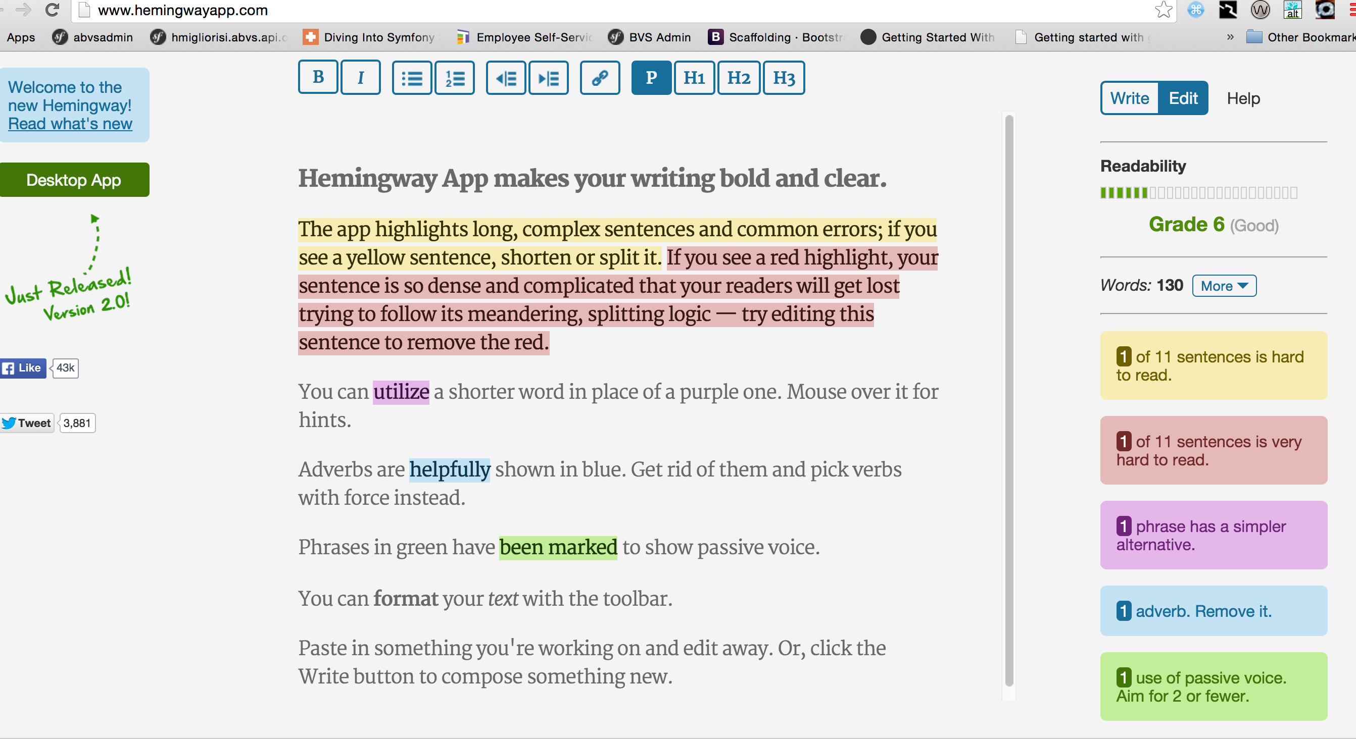
- http://www.hemingwayapp.com/
Chrome Testing Tools
- Tenon
- Wave
- Chrome Developer Tools
- aXe
- NoCoffee
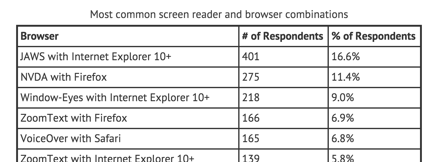
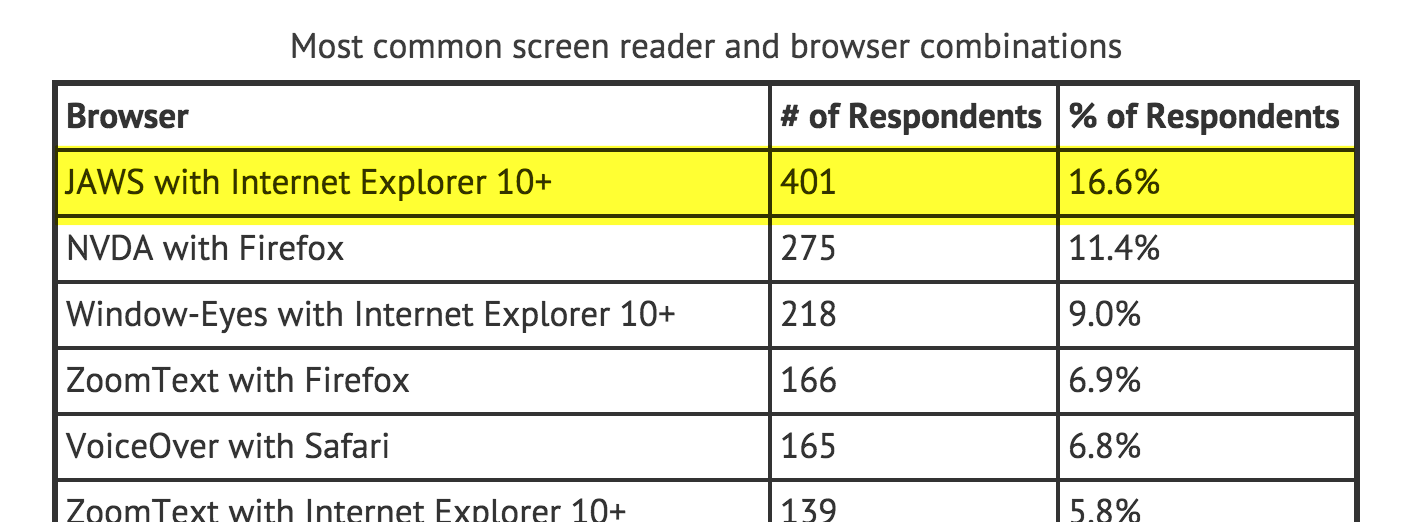
Assistive Technology
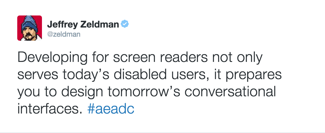
Screen Reader

& Test Using Other AT
Test With Real Users
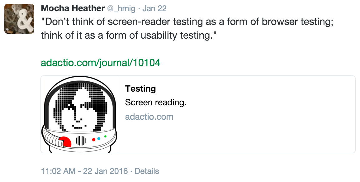
Think of it this way: you wouldn’t want a designer or developer to do usability testing by testing the design or code on themselves. ... They’re already familiar with what problems the design is supposed to be solving, and how the interface works. - Jeremy Keith
Please Don't Feel Overwhelmed?
Progress is Better than Perfection

Allow Involvement